
How to Pick Team Colors That Work on a Jersey
A practical method for choosing team jersey colors: value contrast, three-color systems, home and away sets, color vision, and how fabric shifts the print.
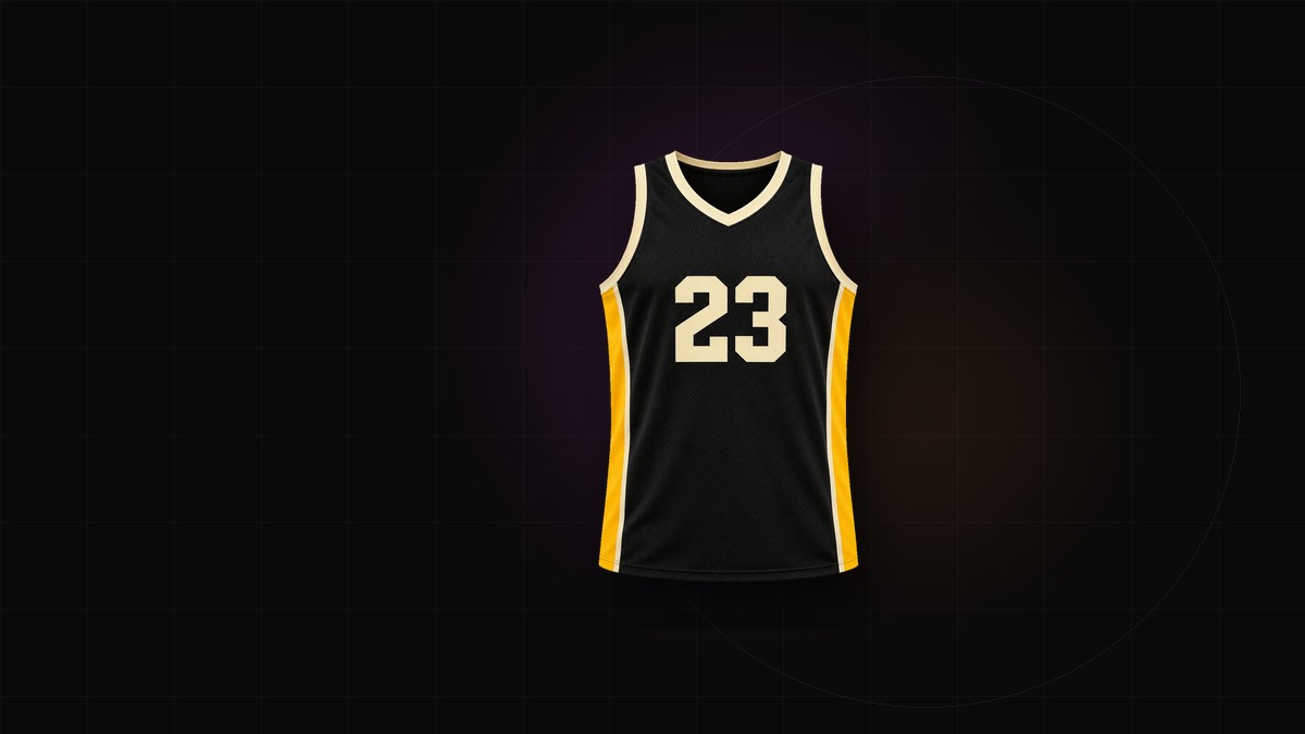
Picking team colors usually starts with a favourite hue and ends with a shirt nobody can read from the sideline. The colors look fine on a screen; they fail on fabric, at distance, under floodlights, against the next team's kit.
A better order is value, jobs, then hue. Here is a method that survives production.
Start with value, not hue
Value is how light or dark a color is. Two colors can be completely different hues and still collapse into the same grey.
Before you commit, convert the palette to greyscale. If the base and the accent sit at the same value, the trim disappears at distance no matter how different the hues look in the editor.
A quick test: squint at the design from across the room. If the shapes flatten into one tone, the values are too close.
Give every color a job
Most good kits use three colors with defined roles:
- Base — the largest area, and the color people remember.
- Accent — trim, collar, cuffs, numbers, side panels.
- Neutral — white, cream, black or grey, used to separate the other two.
A fourth color can work if its job is small and specific: a crest ring, a single stripe, a sponsor mark. Four colors competing for equal area is how a shirt starts to look like a training bib.
Write the jobs down. "Navy base, gold accent, white neutral" is a system. "Blue, yellow and white" is a set of preferences.
Contrast is structural
Contrast is not a taste question. It decides whether the number is legible, whether the crest reads, and whether two teams can be told apart.
- Numbers and names must contrast with the base, not just with the trim.
- An outline is a repair, not a design idea. If a number needs a heavy outline to be visible, the base and number colors are too close in value.
- Test the shirt against the ball, the pitch or court, and the referee's kit. A kit that matches the officials is a problem nobody notices until match day.
Light and dark pairs are the most reliable. A dark base with light numbers, or the reverse, will always read.
Home, away, alternate
Plan the set before you order the first shirt.
- Home carries the identity: the strongest combination, used most often.
- Away should contrast with the home kit and with the common opponents in your league. Many teams use white, cream or a dark alternate; a bold clash kit is a valid choice as long as it is clearly different.
- Alternate is a third look, not a second home shirt. It works best when it borrows one element from the home kit: the same accent, the same number treatment, a different base.
Decide the rules early: which kit is worn where, who decides, and what happens when both teams turn up in dark shirts. A goalkeeper kit also needs its own treatment. Keepers are usually given a distinct color, and it should not clash with either team's outfield kit or with the referee.
Consider color vision deficiency
Color vision deficiency is common, especially among men, and it changes how red and green, or blue and purple, separate from each other. A kit that depends on "our red against their green" is a kit some players and spectators cannot read.
- Use value contrast as the main separation, with hue as the second signal.
- Add a structural difference: stripes against a solid, light shorts against dark, a distinct sleeve.
- Run the palette through a color-blindness simulator before you order, and ask players who have color vision deficiency what they see.
This is not an accessibility checkbox. It is match-day clarity.
Fabric changes the color
A hex code is a reference, not a guarantee. The same color behaves differently on different materials:
- White bases keep colors bright. Dark or colored bases mute them.
- Sublimation prints into polyester, so the surface texture and sheen affect the result, especially on mesh.
- Two fabrics, same recipe can produce two visibly different colors.
- Fluorescent and metallic finishes are harder to reproduce in sublimation than they look on a screen; treat neon accents with suspicion.
Order a physical swatch or a single sample shirt before a full team order. Then look at it outdoors and under floodlights. Colors shift under both.
Test the palette in this order
- Convert to greyscale and check that the base, accent and numbers separate.
- View it from several metres away, at the size the number will actually be.
- Run a color-blindness simulation.
- Compare it against the kits of the teams you play most.
- Approve a physical swatch, not just the screen.
Write the system down
Record the hex values, the Pantone reference if you have one, and the job each color performs. Future orders, replacement shirts and youth sets will match, and a new designer will not have to guess which blue was the real one.
When you are ready to build the kit, the jersey generator lets you apply the palette to a full template before you commit. For a court kit, start from the basketball jersey generator.