
Sublimation Jersey Design: A Print-Ready Guide
A print-ready guide to sublimation jersey design: file setup, color and bleed, thin lines, gradients, panel seams and proofing before production.
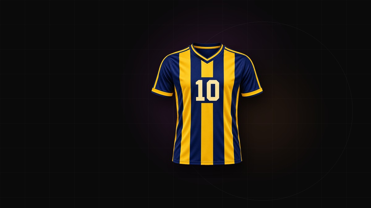
Sublimation is not printing on top of a shirt. The ink is printed onto transfer paper, then heated until it turns to gas and bonds with polyester fibers. The color becomes part of the fabric: no thick layer, no cracking, and no cost per color. It also behaves like dye rather than paint — it spreads slightly, follows the weave, and can only be as light as the fabric underneath.
Sublimation jersey design gets simpler when you work with that process. Design against it and the proof will surprise you.
1. Start from the garment template
Do not design on a T-shirt-shaped rectangle. Use the printer's panel templates: front, back, sleeves, collar, cuffs and side panels, each one drawn with seam allowance already included. Work at 1:1 scale. Keep type and crest artwork vector where possible, and treat 300 DPI at final size as a safe raster target; some shops accept less for soft patterns, so ask.
Keep the file layered: background, pattern, crest, sponsor, name and number. The printer may need to move one element without touching the others.
2. Set color before you draw
Ask the printer which profile they want — sRGB, CMYK, or their own ICC profile — and supply colors in that space. Screen color is not fabric color. Saturated blues, greens and oranges shift during transfer, and the shift is easier to manage before the artwork is finished than after.
Match critical brand colors against a physical swatch or a Pantone-to-polyester conversion provided by the printer. Limit yourself to two or three critical colors; everything else can drift a little.
There is usually no white ink in the process: white is the shirt. On a dark garment, white areas may need a white base layer or a different decoration method. Confirm this with your supplier before you build a design around reversed-out type.
3. Bleed, safe zones and seam allowance
Extend every background and pattern past the cut line. A bleed of roughly 3–5 mm is common, but the printer's template is the authority. Keep text, crests and sponsor marks out of seam allowance and hems; a logo that sits 2 mm from a seam will be clipped or distorted when the panel is sewn.
Check the small pieces separately. Collars and cuffs are narrow strips, so trim that looks generous on the body can disappear there.
4. Why thin lines behave differently
Sublimation ink spreads slightly as it bonds with the fiber. Fine strokes fill in, small counters close, and hairlines that look sharp on screen can vanish. A practical starting point is a minimum stroke of about 1.5 mm at final size, with gaps between lines at least as wide as the lines themselves — then confirm the real number with your printer.
This is why thin scripts, hairline serif faces and one-pixel borders are risky in names and numbers. Choose a block or varsity face with open counters, and keep fine detail away from the edges of a panel.
5. Why gradients behave differently
A gradient is a series of very close color steps. On fabric, those steps can become visible bands, especially across a large panel and especially in dark-to-light transitions. Spread the fade over a longer distance, avoid tight gradients in small areas, and ask whether the printer's RIP dithers the file. If it does not, a little noise in the artwork can help hide the steps.
Gradients also interact with construction. Each panel is printed separately, so a gradient that crosses a side seam can restart or jump. Design the fade panel by panel, and check that any number sitting inside it keeps contrast at both ends.
6. Design for seams, not around them
The shirt is printed flat and sewn afterward. That order makes seams the most common source of error:
- Hoops and stripes must line up at the side seam and continue down the sleeve.
- Raglan sleeves change the direction of a stripe; decide which way it runs before printing.
- A crest or sponsor placed across a seam will distort.
- The same absolute pattern looks denser on a narrow sleeve than on the body.
Preview the design as a sewn garment, not as a flat rectangle, before you approve it.
7. Proof before production
Start with a digital proof at 100% scale. Check spelling, numbers, sponsor placement and color values. Then get a physical strike-off for anything you care about: brand colors, gradients, thin lines, and dark backgrounds. View it in daylight, not under office lighting, and stretch the fabric — sublimation stretches with the garment, and fine lines can open up or close.
For a large team order, approve a sewn sample. It is cheaper than replacing a full run.
Handoff checklist
- Layered source file plus a flattened 1:1 PDF with bleed.
- 300 DPI PNG for reference, with a transparent background if needed.
- ICC profile or sRGB values, plus physical references for critical colors.
- Fonts outlined or packaged.
- Front and back views, and a mockup for approval.
Where the mockup fits
A mockup is for presentation and sign-off; the panel files are what get printed. Use the jersey mockup generator to show the kit on a garment, and start the design itself in the jersey generator so the pattern, crest and numbers are described separately before the printer asks for the final file.