
How to Prepare a Jersey File for a Print Shop
A practical preflight guide to jersey print files: formats, resolution, bleed, safe areas, color, outlined fonts, naming and front/back separation.
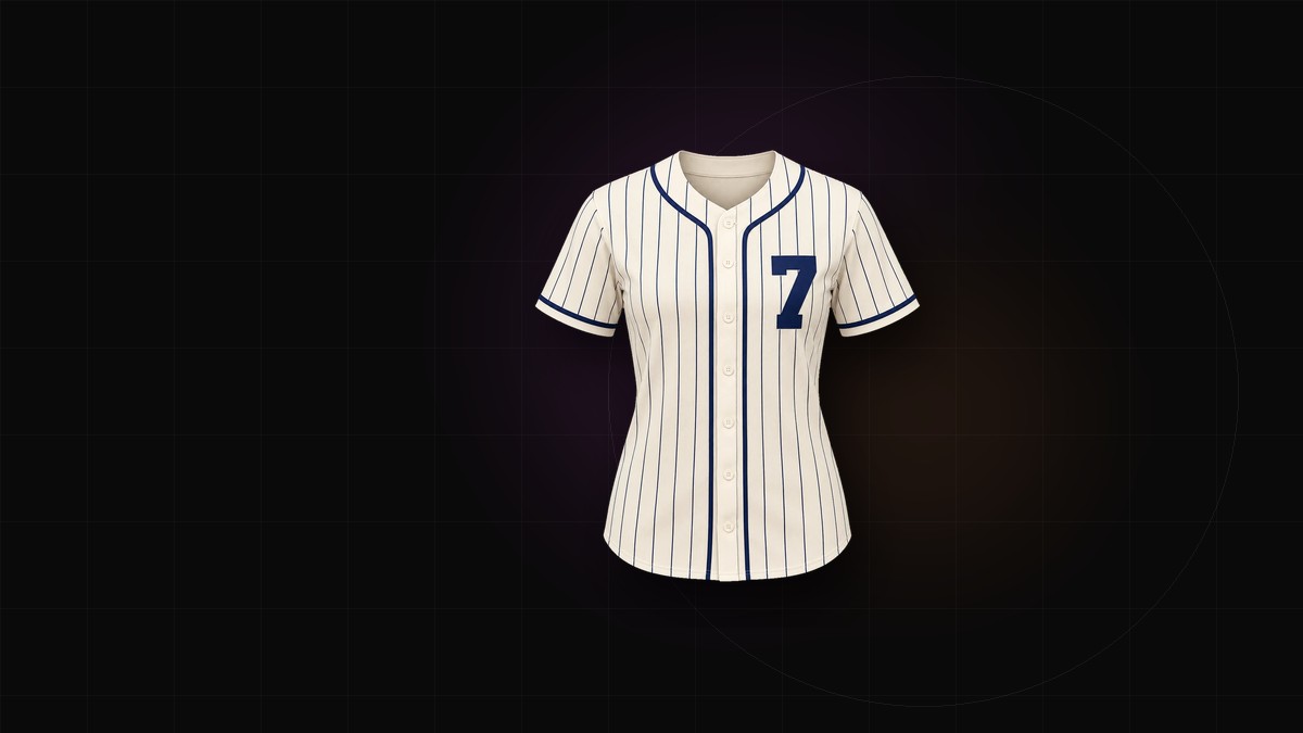
Most jersey orders go wrong before the printer touches fabric. The design looks correct on a laptop, the order is paid, and then the shop replies with questions the buyer cannot answer: which file is the back, how much bleed is included, and why do the player names use a font that will not open.
A print-ready jersey file is not a design achievement. It is a document with no ambiguity left in it. The shop should be able to open it, place it on a template and print without calling you.
Here is how to get there.
Choose a format the shop actually accepts
Ask before you export. Print shops differ, and the file that works for one workflow can be useless for another.
- PDF is the safest vector container. It holds text, vector shapes and raster elements, and nearly every shop accepts it.
- SVG suits cutters and some sublimation workflows, but check that the shop's software handles text and embedded images the way you expect.
- PNG is the reliable raster option when vector is not available. Use it at final print size, not at screen size.
- TIFF is accepted by some shops for large raster art, but file sizes grow quickly.
- JPG should be avoided for flat artwork. Compression creates halos around hard edges and numbers.
- AI or EPS may be welcome, but do not assume it. A flattened PDF is more portable than a native file from an unfamiliar app.
If the shop gives you a template, use their template. Do not rebuild it from memory.
Resolution: measure at final size
DPI only means something next to physical dimensions. A file can be 300 DPI and still be too small if it was designed for a postcard.
Work backwards from the printed size. A jersey front roughly 60 cm wide needs around 7,000 pixels across at 300 DPI. Many sublimation shops accept 150 DPI for large areas of flat color, but logos, small text and fine trim need more. Never upscale a low-resolution logo and call it done; it will still look soft on fabric. Rebuild logos as vectors whenever possible.
Bleed and safe area
Jersey panels are cut and sewn. The printer does not print to the exact edge of the finished garment, and the seam allowance eats into the artwork.
- Add 3–5 mm of bleed beyond the cut line on every edge.
- Add more for all-over prints that stretch over the body.
- Keep crest, sponsor marks and numbers 10–15 mm inside the seam.
- Check sleeve and collar edges separately; graphics near those seams disappear quickly.
Show the cut line and safe area on a guide layer or a marked proof. A design that is technically correct but visually cramped still looks wrong on the finished shirt.
Color: specify, do not hope
A screen emits light; fabric reflects it. The same HEX value can look brighter, duller or dirtier on polyester.
List colors explicitly: HEX for digital reference, plus a Pantone or CMYK value for production. Bright synthetic greens and blues are the usual casualties. Deep black prints closer to charcoal, so do not rely on it for fine detail. If color accuracy matters, ask for a fabric swatch before approving the run.
Keep large gradients away from stretch panels. Banding and seam mismatch show up there first.
Outline the fonts
There are two acceptable approaches: embed the fonts in the PDF, or convert text to outlines. Embedding keeps names and numbers editable but depends on the shop's software honoring the embedded font. Outlining removes the risk of substitution entirely.
Whichever you choose, proofread before you finalize. Once text is outlined, fixing a misspelled surname means rebuilding the layer. Keep an editable master file with live text, and export a separate outlined production copy.
After outlining, inspect the counters in 8, 6, 9 and 0. Closed or pinched bowls are a common export error, and they are hard to spot at thumbnail size.
Name every file like a stranger will read it
The person receiving your files did not sit in your design meeting. A clean naming pattern removes guesswork:
northside_2027_home_front_v3.pdf
northside_2027_home_back_v3.pdf
northside_2027_home_sleeve_left_v3.pdf
Include team, season, kit, panel, version and date. Avoid names like final_final. Add a cover sheet with the team contact, color values, fabric, quantities, size breakdown and the full player list. That single page prevents most back-and-forth.
Separate front, back and sleeves
Some shops want one combined sheet for review; most production workflows want panels. Provide front, back and each sleeve as separate files or clearly labeled artboards, plus a combined preview for reference.
If a pattern continues across a seam, add alignment marks and a short note explaining the intended join. Do not make the printer infer how two panels meet.
Preflight checklist
Run this before uploading:
- [ ] Fonts outlined or embedded, with no missing-font warnings
- [ ] Raster elements at final-size resolution, 300 DPI where possible
- [ ] 3–5 mm bleed on every cut edge
- [ ] Crest, sponsor and numbers inside the safe area
- [ ] Colors listed as HEX plus Pantone or CMYK
- [ ] Front, back and sleeves separated and labeled
- [ ] Player names and numbers checked against the roster
- [ ] File names carry team, kit, panel and version
- [ ] Hidden layers and stray artboards removed
- [ ] PDF opens correctly on a second machine
Ten minutes of preflight is cheaper than a reprint.
Build the design in the jersey generator so the front and back are described separately instead of baked into one flat image. Then use the jersey mockup generator for the approval preview. Keep the two outputs distinct: the mockup sells the kit, and the production file is what gets printed.