
12 Classic Jersey Patterns Explained
Twelve jersey design templates — solid, stripes, hoops, sash, halves, checkerboard and more — with notes on when each works and how it prints.
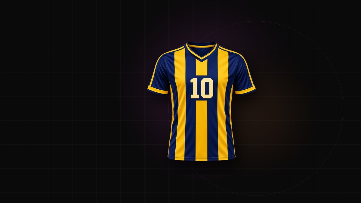
A jersey pattern has three jobs: identify the team from the far side of the pitch, survive cutting and sewing, and leave a calm place for the crest, sponsor and number. Most patterns that fail are not ugly. They were drawn flat, judged in a thumbnail, and never tested at distance, at full size, or across a seam.
Here are twelve jersey design templates: what each does well, where it gets into trouble, and what to check before print.
Start with scale, not style
A pattern is a system of repeat and contrast. Decide the size of one motif — a stripe, a check, a petal — before the pattern itself. The same checkerboard looks crisp at 4 cm squares and like static at 1 cm. Set the scale on the real garment, then look from 10 meters. If it flattens into a solid color, it is too fine.
1. Solid
The most versatile template and the hardest to make memorable. The emphasis sits on color and trim: collar, cuffs, side panels, crest. Choose the shade from a physical swatch, because a large single-color area shows batch variation and fabric texture. Right color: premium. Almost right: a blank.
2. Vertical stripes
The default club pattern: legible, traditional, easy to scale. Keep the count low enough that the back number sits on two or three stripes, not eight. Stripes should continue across the side seam and down set-in sleeves without a jump. On raglan sleeves, decide whether the stripe follows the body or the sleeve.
3. Hoops
Horizontal bands read strongly at distance and suit rugby, hockey and retro soccer. Fewer, wider hoops look more confident than many narrow ones. The back number is the conflict: over busy hoops it loses its edge. Place it on a solid panel or stop the hoops at the shoulder blade.
4. Diagonal sash
One band from shoulder to opposite hip. It suggests movement and gives a plain shirt a focal point. On the front, keep the crest clearly inside or outside the sash. On the back, a sash can cut through the number, so fade it, narrow it, or stop it at the side seam. Continue it over the shoulder seam or it reads as a patch.
5. Halves
A vertical split in two or four colors. Strong blocking with almost no print risk, because the pattern is just an edge. The edge must sit exactly on the center line, and the crest and sponsor need contrast on the half where they land. A sponsor crossing the divide needs an outline or a different placement.
6. Pinstripes
Thin vertical lines, at home in baseball and classic soccer. They add texture without shouting, but they are the pattern most likely to vanish in sublimation. Ask the supplier for their minimum stroke width, keep spacing generous, and keep small crests on a solid panel.
7. Checkerboard
High energy and entirely dependent on scale. Large checks read as color blocking, small checks as texture, and the middle range as a race flag. Align the grid at the side seams or it looks broken. A number over checks needs a solid outline or a knockout panel. Fine checks can shimmer on video, so preview first.
8. Gradient
A fade from dark shoulders to a pale hem, or a blend across the body. Gradients look modern and photograph well, but are hard to control on fabric. Long, smooth transitions are safer than short, tight ones, which can band. Proof physically. If a number sits inside it, check contrast at both ends.
9. Camouflage
Camouflage is texture, not a picture. Keep the palette tonal and the shapes large enough to read at distance; small, high-contrast camo turns into noise and fights the number. Build a seamless swatch and test where the seams fall. Invent the shapes rather than borrowing military patterns.
10. Geometric panels
Angular blocks, chevrons and cut-lines that follow the garment's construction. Make the seam part of the design and the kit looks engineered; ignore it and the seams look like mistakes. Avoid thin color slivers near a seam, where seam allowance eats them. Strong for esports, basketball and training kits.
11. Floral
Floral works for anniversary kits, charity matches, sevens tournaments and clubs that want something warmer than stripes. A large bloom reads as a graphic; hundreds of tiny flowers read as texture and can hide numbers. Simplify petal outlines, which fill in during sublimation, and keep the back panel calmer than the front.
12. Abstract
Brush marks, marble, distorted grids, generated noise. Abstract patterns give a new club a distinctive look without borrowing another club's history. The trade-off is repeatability: a hand-painted or AI-generated composition may not tile, or reproduce exactly on a reorder. Keep a high-resolution master and approve a strike-off before the full run.
Choose one loud element
Most good kits have a hierarchy: a dominant color, one pattern, a small accent. Two loud patterns — checks plus a sash, camo plus a gradient — compete for attention and usually win at the expense of the number. Busy pattern, quiet trim. Busy trim, solid body.
Print checks before approval
- Thin lines: confirm the printer's minimum stroke width at final size; crisp on screen can disappear on fabric.
- Seams: hoops, stripes and checks must line up at the side seam and sleeve.
- Bleed: extend the background past the cut line so a shift does not leave a white edge.
- Dark bases: sublimation prints into light polyester; a deep black or navy may need a white underlayer or another method. Ask first.
- Repeat: save the master file with scale and placement for reorders.
Test the pattern at full size
A jersey is judged at 10 meters and touched at 30 centimeters. Preview it on a full garment, front and back, with the crest and number in place. The jersey generator swaps patterns at production scale without redrawing the shirt. For a sport-specific start, the soccer jersey generator sets the collar, sleeves and seams first.