
How to Design a Soccer Jersey: A Practical Guide
A step-by-step guide to designing a soccer jersey — choosing a template, colors, patterns, crest placement, numbers and a print-ready file.
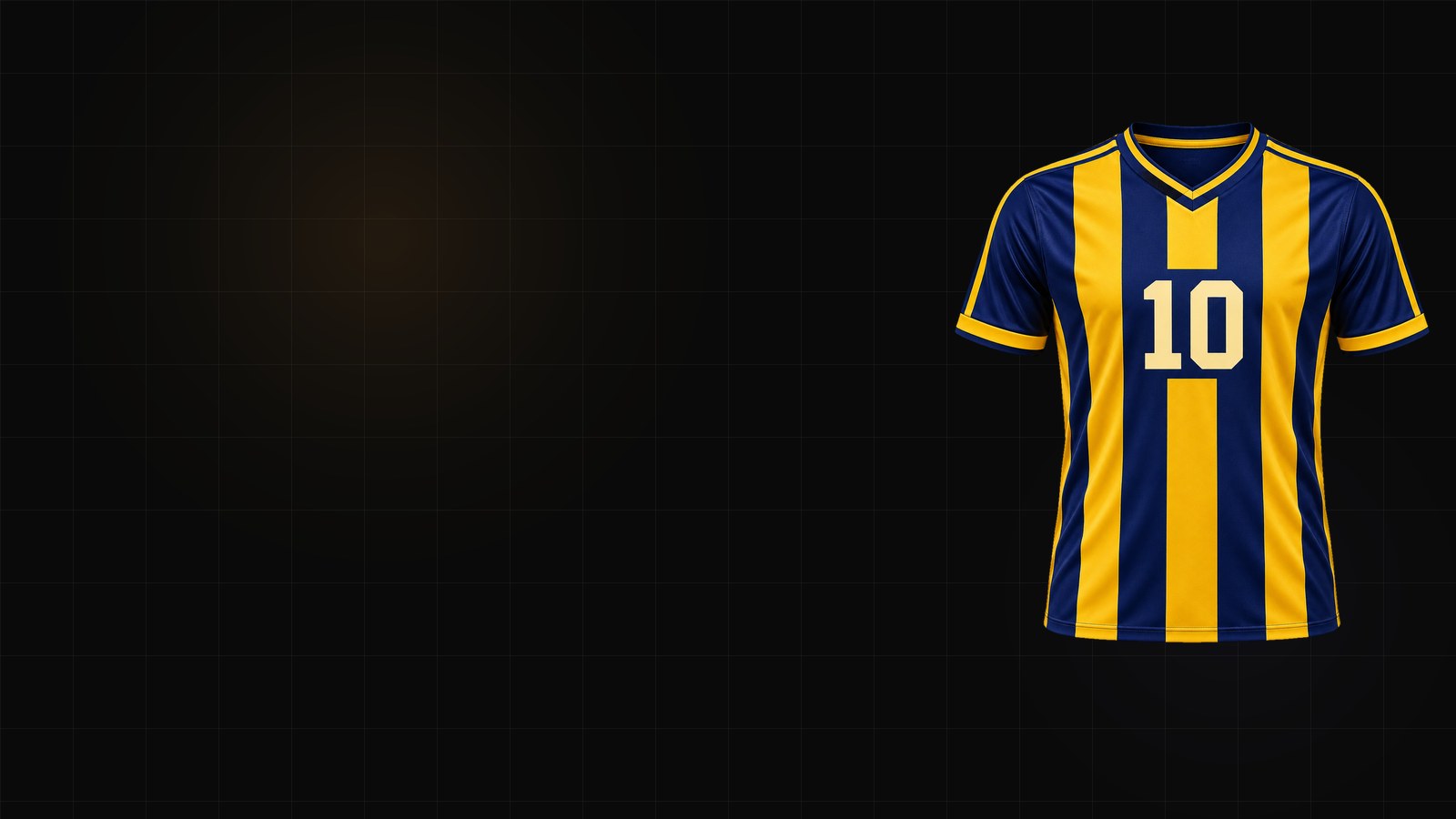
A soccer jersey looks simple from the stands: a shirt, a crest, a number. In production it is a stack of decisions — cut, collar, sleeve trim, side panels, pattern scale, sponsor placement, number font, and a file that a print shop can actually use.
This guide walks through the same order we use in the soccer jersey generator, so you can go from an idea to a production-ready kit without guessing.
1. Pick the cut before the colors
The cut decides what every other decision looks like:
- Crew neck — the safest all-round choice; works for almost every club.
- V-neck — sharper, common in modern kits.
- Set-in vs raglan sleeves — set-in gives a clean shoulder line; raglan moves the seam and changes how stripes read.
- Slim vs standard — a slim cut makes patterns look denser; standard is more forgiving for team orders.
Choose the cut first. A pattern that looks great on a standard cut can look cramped on a slim one.
2. Build a three-color system
Most memorable kits use three colors with clear jobs:
- Base — the largest area. This is the color people remember.
- Accent — used for trim, collar, sleeve cuffs and numbers.
- Neutral — white, cream or black, used to separate the other two.
If you add a fourth color, give it a small job — a crest ring, a sponsor mark, a single stripe. Four colors fighting for equal area is how a kit starts to look like a training bib.
3. Choose a pattern that survives production
Classic patterns work because they are easy to reproduce:
- Vertical stripes — the default for a reason. Keep stripe width consistent across the body and sleeves.
- Hoops — strong in hockey and rugby; in soccer, keep the hoop count low so numbers stay readable.
- Diagonal sash — one bold band, usually from shoulder to hip. It reads well on TV and in photos.
- Halves — split the body left and right. Make sure the crest and sponsor sit on the calmer side.
- Pinstripes — thin lines; check them at print scale, because thin lines can disappear in sublimation.
Whatever you choose, preview it at the actual size. A pattern that looks good in a thumbnail can become noise on a full kit.
4. Place the crest, sponsor and numbers
There are conventions, and breaking them should be a choice:
- Crest — left chest, roughly 7–9 cm wide.
- Sponsor — center chest; keep it below the collar and above the number.
- Front number — center, often 15–20 cm tall.
- Back number — 25–30 cm tall, with the name above it.
- Sleeve marks — optional; keep them away from the seam.
Treat them as separate decisions: move the crest without touching the pattern, and change the number font without redrawing the shirt.
5. Pick a number font that reads at distance
Block and varsity fonts are the safest. Script fonts look great in close-up but can lose legibility at 20 meters. If you use an outline or shadow, check that the inner counter of 8, 6 and 9 stays open.
6. Export the right file
For a print shop, a flat PNG is usually not enough. Ask for:
- a front and back view,
- 300 DPI at production size,
- a transparent background,
- SVG if the printer can accept vector,
- the color values (HEX plus a Pantone suggestion).
The jersey mockup generator is useful for presentation, but the production file is what gets printed.
A simple workflow
- Start from a sport-specific template.
- Set base, accent and neutral.
- Choose one pattern and keep the scale consistent.
- Place crest, sponsor, name and number.
- Preview front and back.
- Export SVG plus a 300 DPI PNG.
That is the whole job. The soccer jersey generator puts those steps in one place, and the pricing page explains which exports each plan includes.