
Esports Jersey Design: A Practical Guide
How to design an esports jersey that reads on stream and on stage: logo hierarchy, sponsor blocks, panel layout, contrast and mockup checks.
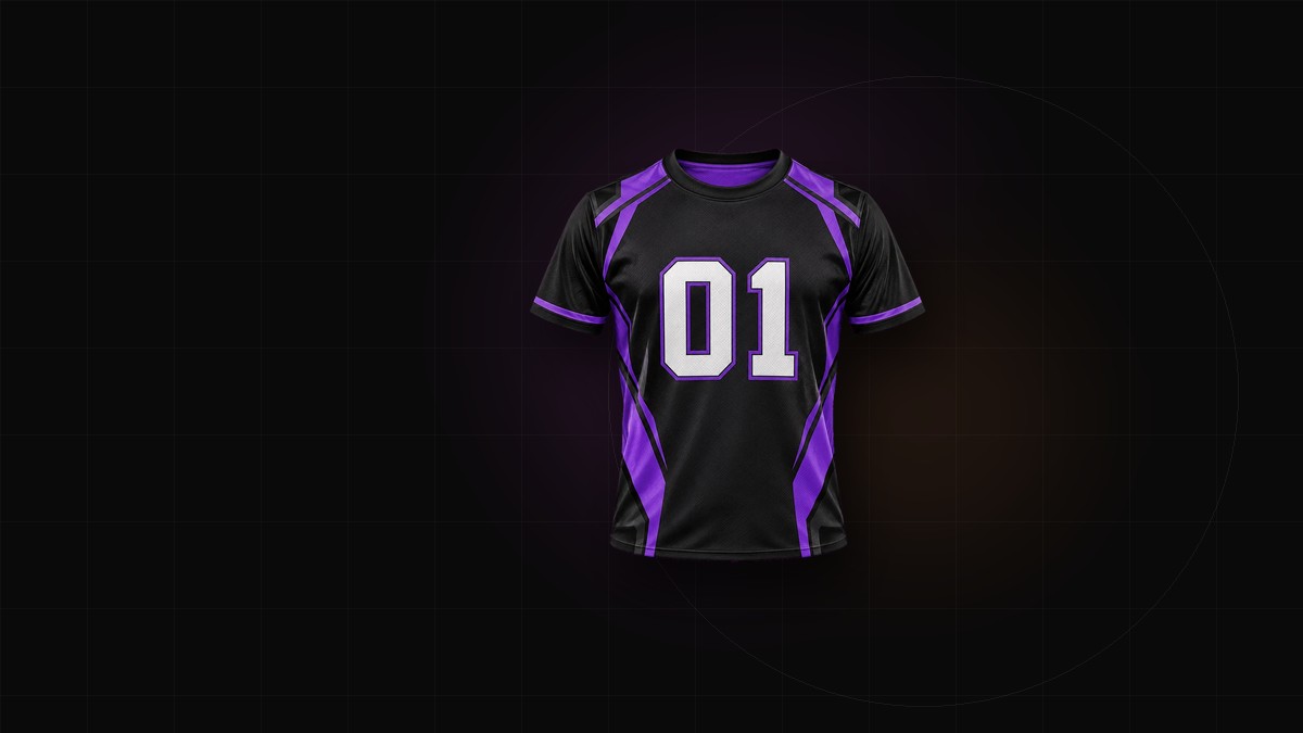
An esports jersey has two audiences: viewers watching a compressed stream and people in a venue looking at a player from twenty rows away. The camera is less forgiving than the printer. Design for the worst viewing condition, and the good ones take care of themselves.
Design for the stream before the shirt
Streaming compression smears fine lines, small type and low-contrast detail. On top of that, broadcast overlays cover shoulders and the lower chest, and player cameras usually crop somewhere around the mid-torso. A design that reads beautifully in a flat mockup can arrive on screen as a dark rectangle with a smudge.
Practical rules:
- Use fewer, larger shapes.
- Keep the team mark high on the chest or centered, where overlays are least likely to sit.
- Avoid hairline outlines and tiny secondary text.
- Do not put critical information on sleeves; they get cropped, folded or hidden by a headset cable.
The reliable test is a screenshot at roughly 200 pixels wide. Whatever still reads at that size is doing the work.
Build a clear logo hierarchy
An esports jersey usually carries three tiers of information: the team, the game or league, and the sponsors. Only one of them should get maximum contrast. When everything shouts, nothing is heard.
- Team identity — the primary mark or wordmark, largest and most legible.
- Game or league — secondary, smaller, usually near the chest or shoulder.
- Sponsors — grouped and consistent, not scattered.
Put the team mark where a player camera will catch it. Treat the game title as a supporting element rather than a second logo of equal weight.
Group sponsor logos into blocks
Scattered sponsor marks look like stickers applied after the fact, and each one fights the pattern behind it. Reserve defined areas instead: center chest, upper back, or sleeves.
- Render sponsors at the same optical weight. If one logo is a solid wordmark and another is a detailed emblem, place each on a solid patch or convert both to a single color.
- Keep spacing and height consistent across the row.
- Give the block a calm background so the marks do not sit on a busy pattern.
- Check the current league or tournament rules for sponsor size and placement. They change, and copying another team's layout is not a substitute for reading the rulebook.
A sponsor block should look like a system, not a collection.
Design with the panels, not on top of them
A jersey is cut from separate panels: front, back, sleeves, collar and side gussets. Artwork that ignores those seams looks accidental once it is sewn.
Continuous graphics need alignment marks and a note explaining the intended join. Keep detailed art on the flatter front and back panels. Side panels and underarms stretch, so simple color or a low-detail pattern holds up better there. Raglan sleeves change the shoulder line entirely; a graphic that works on a set-in sleeve may break in the wrong place on a raglan.
Mock the design on a body, not a flat rectangle. Drape, seam placement and stretch all change how a pattern reads.
Use color for legibility, not decoration
Dark base plus one bright accent is the dependable combination on stream. A few practical adjustments:
- Pure black loses detail; a near-black with a slight hue holds shadow and texture better.
- Pure white blows out under stage lights; off-white is safer.
- Back names need real contrast against the panel, not just a different hue at the same brightness.
- Check the design in grayscale. If the hierarchy collapses, it will also collapse on a bad monitor.
Test the palette against the broadcast overlay and social templates. The jersey is one asset in a visual system, not a standalone object.
Put the player on the back
Handles vary in length, and a long one can wrap, shrink or collide with the number. Decide a maximum length and a fallback before names are collected: initials, a shortened handle, or a standard format.
Numbers should be large enough to read on a wide shot. Check how the name and number sit when the jersey is worn over a hoodie or tucked, because players often layer. A back panel designed on a flat mannequin can lose its lower third in a seated pose.
Mockups close the gap
Flat artwork hides fit, drape and logo distortion. Mock the front, the back and a seated desk pose, because that is how players actually appear on camera. Check whether chest marks fold when the player leans forward, and whether the back name clears the chair line.
The jersey mockup generator is the right place to test placement before committing to production. Present the mockup to sponsors as well; they care about how their mark reads in a still frame.
Production notes
Sublimation handles full-color, all-over designs well, but fine gradients can band on polyester and very thin lines can drop out. Supply sponsor marks as vectors, outline fonts before export, and ask for a physical sample when the design is complex or the color match is critical.
Start the layout in the esports jersey generator, keep the hierarchy simple, and let the mockup catch what the flat file cannot. A jersey that reads at thumbnail size will read on stage, on stream and in every photo the team posts afterward.