
Best Jersey Fonts for Names and Numbers
A practical guide to jersey fonts: block, varsity, script, italic and condensed faces, and how to keep names and numbers readable at distance.
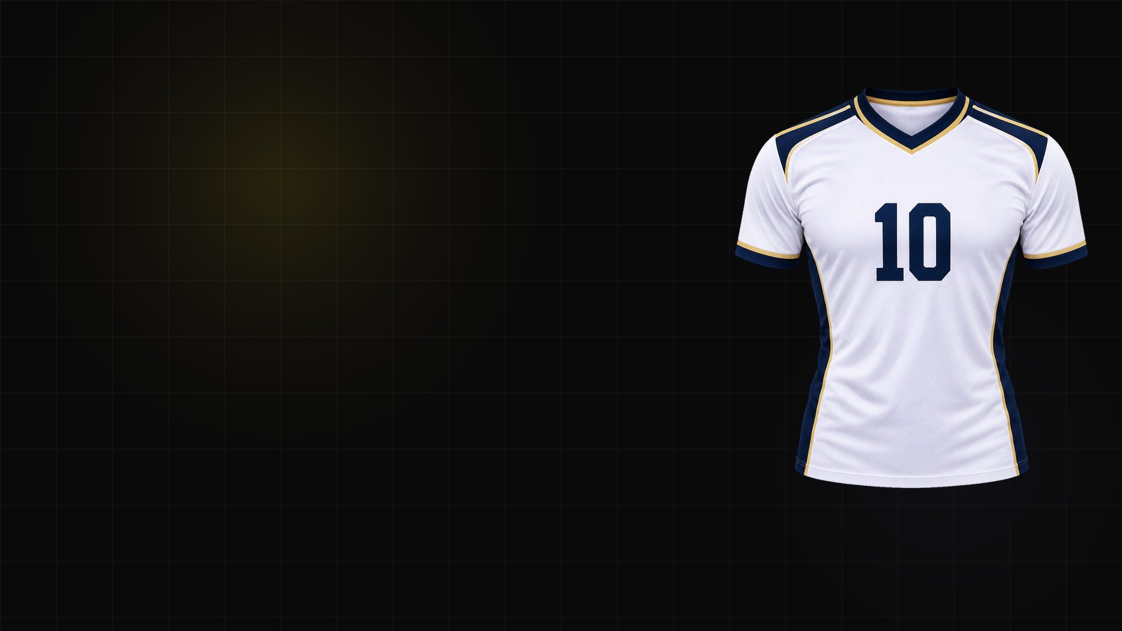
Jersey typography has one job: be readable at distance, on fabric, under motion. That rules out a lot of fonts that look good on a poster.
Here is how to choose a name and number font that survives the field, the screen and the printer.
1. Block fonts: the safe default
Block sans-serif faces are the most common choice because they hold up at every size. Look for:
- Open counters — the holes in
8,6,9and0must stay open. - Even stroke weight — thin strokes disappear in sublimation.
- A tall x-height — names read better when lowercase letters are not tiny.
If you only pick one font for a team, pick a block.
2. Varsity and collegiate fonts: character without chaos
Varsity faces add a sporty, American look. They work well for schools and clubs, but check:
- the
Iand1are distinguishable; - the outline does not close up the counters;
- the font still reads when the number is 25 cm tall.
Varsity plus a contrasting outline is a classic combination. Varsity plus a shadow plus a gradient is usually one effect too many.
3. Script fonts: use them for the crest, not the number
Script lettering looks great for a team name or a wordmark. For the back number, it is risky: the thin connecting strokes can vanish at distance.
If you want script, use it for the name or the crest, and keep the number in a block face. Mixing one expressive face with one neutral face is usually stronger than mixing two expressive faces.
4. Italic and condensed: speed, with a cost
Italic suggests motion. Condensed fits long names into a narrow back panel. Both reduce legibility:
- Italic is fine for short names and numbers; long names start to lean into each other.
- Condensed is useful for long surnames, but do not condense below roughly 85% or the strokes get too thin.
5. Contrast and outline rules
- Light text on a dark shirt needs more stroke weight, not more shadow.
- A contrasting outline helps on busy patterns; keep it even on all sides.
- Do not put a thin font on a striped pattern without an outline — the stripes will eat the letters.
6. Test at the real size
Print the name and number at the actual production size and look at them from 5 meters away. If you cannot read them, neither can the crowd.
The jersey font generator lets you preview names and numbers on a jersey back before you commit. Once the type is set, take it into the jersey generator and finish the rest of the kit.